|
#31
|
|||
|
|||
|
Quick update: we've had the design team working on an Outlook-like skin (in gray) since before this thread started. We expect that at least a gray, if not also a blue version of this skin will be in 7.0 final (if not, then it will be available shortly thereafter). We'll post samples here as we get closer.
Thanks for all the feedback so far (even the harsh feedback :) A further question: has anyone ever seen a design that they like aside from Outlook clones, and that believe would be fairly universally acceptable in business applications? 
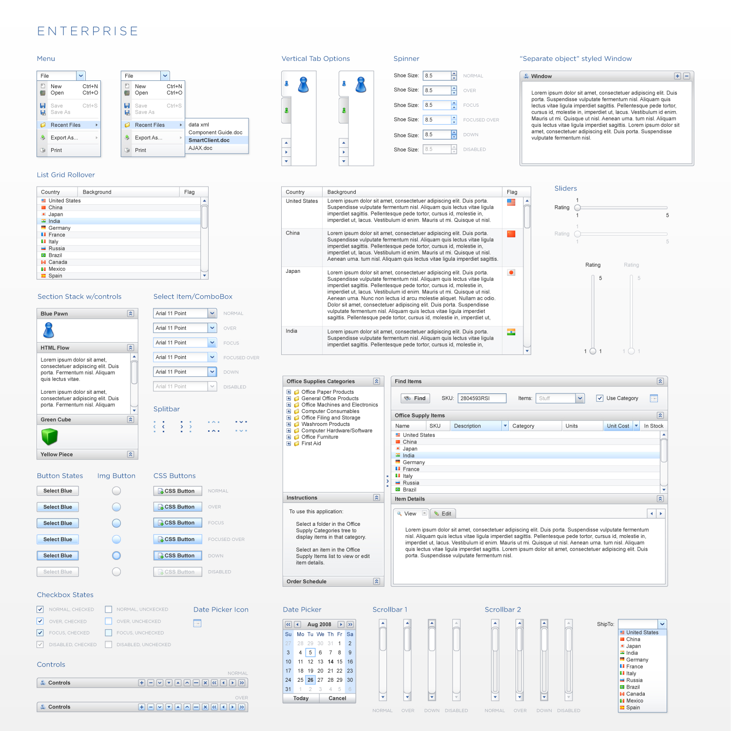
We're committed to supporting an Outlook-esque look and feel, but for future designs we'd like to understand what people would like to see. BlackOps is design for developer tools and TreeFrog is popular in life sciences companies, where else do we need to go? |
|
#32
|
|||
|
|||
|
I like the mac os x/ itunes look. Something different and clearly very popular.
![]() ![]() ![]() ![]() With the miller column grid the layout of the last image can easily be done and will rock. |
|
#33
|
|||
|
|||
|
Something Aqua-esce would be nice, indeed. but that again would work for 'casual' or 'lifestyle' apps only.
What about Nimbus ? ![]() I also like jGoodies Looks (gives swing-apps a consistent look and feel across platforms): ![]() |
|
#34
|
|||
|
|||
|
Thanks a lot for this good news and for your great job !
When the 7.0 final will be available ? |
|
#35
|
|||
|
|||
|
@nlotz
Nimbus looks really nice! Professional, clean, stylish. Great ! Its license is LGPL (https://nimbus.dev.java.net/) so maybe something can be taken from it. The widgets fit in the panels smoothly (I can't stress this enough: it improves the LnF dramatically and it also decreases the development time) jGoodies on the other hand looks really outdated. It's more like a Windows 3.1 LnF today. @SmartCiient Thank you for being so responsive and taking this issue so seriously. I really want to introduce SmartGWT to my client (I think there are many people in this situation) The question, of course, is: can we see it ? when will it be released ? Last edited by juan.medin; 11th Dec 2008 at 14:34.. |
|
#36
|
|||
|
|||
|
Hi we are also interested in switching from GwtExt to SmartGwt but we need the color scheme first. We need management to see that it will look the same before we can switch.
Thanks again for the great framework, Nigel |
|
#37
|
|||
|
|||
|
Quote:
|
|
#38
|
|||
|
|||
|
Hello All,
See below for the first sample from the new skin design. We're looking for feedback BUT please read the list of planned changes below before responding. ![]() The following are all known issues or things we will likely still change: 1. scrollbars are still a work in progress. We might go with some more similar to the default light blue Windows scrollbars 2. you can see some aliasing issues on some components, for example, each opener control in the tree is slightly different, and some other items (like the border around the Window and SectionStack controls) are fuzzed out to 2px instead of 1px. This is due to conversion from vector to pixel format and won't be present in the final design - those will all be sharp 1px lines. 3. the width of the gap around the splitbar will be much smaller (similar to current BlackOps gap) 4. the splitter has a directional "V" in the middle because all splitters are also snapbars in SmartClient (they can hide the adjacent component). 5. tab scrollers aren't actually always visible (they wouldn't be in this screen of course - there's plenty of space). 6. tab scroller will be slight rounded. 7. we're going to do something for the ComboBox down state, it didn't work out. 8. font is still undecided. Shown is arial; we might go to Tahoma or Verdana. If you don't like the choice, switching is a trivial search and replace on the skin_styles.css file. We're also pursuing a parallel design in blue - it will have substantially the same "shapes" for components but will be recolored in the light blue range. Both designs will be ready in the 2-4 weeks range (the gray one sooner than the blue). If you are either starting a new application or porting an existing one, these designs should be ready well in advance of your ship date. You will not need to do anything to your code to use the new skin other than change the skin you are including in your SmartGWT modules file. Let us know what you like and don't like. There's still time for tweaks. |
|
#39
|
|||
|
|||
|
Looks really good, great work.
The font is fine, but I think you should use a more blue scheme for the scrollbar as well (just the buttons), kind of like you have done on the combobox. |
|
#40
|
|||
|
|||
|
Looks really great.
Agree about the scrollbar looking unfinished / out of place. But overall this is really a great work and it will greatly help moving applications from GWT Ext to smartGWT as the look are now similar. |