Hi there,
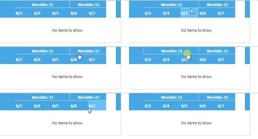
I've noticed there is a new divier-line between the headerlevels. It seems there is some minor bug, when clicking the header-levels.
In the example below the first one gets an border on the left when clicking. The second one gets completely white when clicking.
It looks different if the normal click color of the "days" will be light blue, and the headers are white when clicking. (just my oppinion).
The seperator between the columns looks quite nice. Are there further plans to also include this in a Listgrid?
Please see this already created thread: https://forums.smartclient.com/forum...403#post248403
Version: SmartClient_v111p_2017-08-20_Pro
Browser: Firefox 55.0.2 (32-Bit), Chrome Version 60.0.3112.101
Skin: Tahoe
Density: Medium

Code:
Best regards
I've noticed there is a new divier-line between the headerlevels. It seems there is some minor bug, when clicking the header-levels.
In the example below the first one gets an border on the left when clicking. The second one gets completely white when clicking.
It looks different if the normal click color of the "days" will be light blue, and the headers are white when clicking. (just my oppinion).
The seperator between the columns looks quite nice. Are there further plans to also include this in a Listgrid?
Please see this already created thread: https://forums.smartclient.com/forum...403#post248403
Version: SmartClient_v111p_2017-08-20_Pro
Browser: Firefox 55.0.2 (32-Bit), Chrome Version 60.0.3112.101
Skin: Tahoe
Density: Medium

Code:
Code:
Canvas.resizeControls(4);
Canvas.resizeFonts(2);
isc.Timeline.create({
    "width": "400",
    "height": "100",
    "startDate": new Date(2017, 6, 31),
    "endDate": new Date(2017, 7, 2, 23, 59, 59),
    "headerLevels":
    [{
            "unit": "week"
        }, {
            "unit": "day"
        }
    ],
    "weekPrefix": "WeekNo",
    "labelColumnWidth": 50,
    "showControlsBar": false,
});
Comment